Friday, September 30, 2011

Friends are Flowers that Never Fade

Last Friday my little stamping group decided to play with spray inks. I had not used spray inks prior to this and it was quite a learning experience! We started by putting a coat of gesso on the page. This allows the ink to move around freely, it won't soak into the page.  The actual colors are deeper and richer than shown. Sorry about the photography, my iPhone doesn't come near my Nikon DSL but I was in a hurry! :-)

Click to enlarge
We used Ranger Color Wash Spray and Tim Holtz Distress Stains. After I had some red and yellow swimming around on the page of my 7 x 10 Canson Mixed Media journal, I heat dried it and added some texture with stenciling. Molly had a Crafters Workshop flower patterned stencil, so I used a credit card to swipe some gesso through the openings. I put several random splotches around the page. It looked really cool! Then more spraying fun. Note: gesso comes in various thicknesses. I was using the Claudine Helmuth gesso which is very thick and comes in a jar, not a bottle.

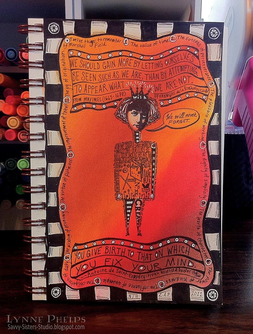
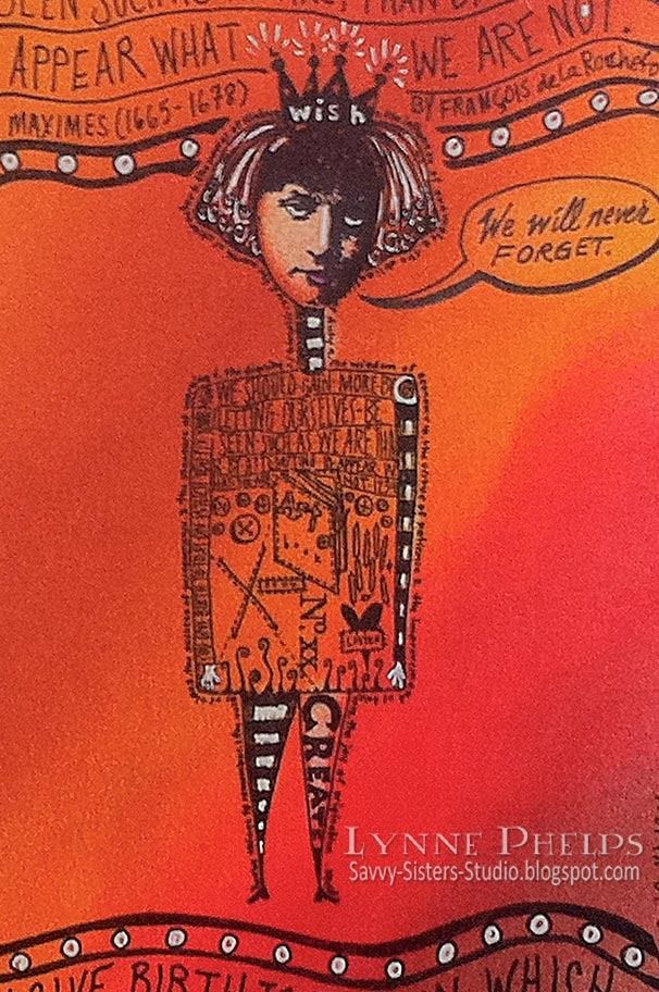
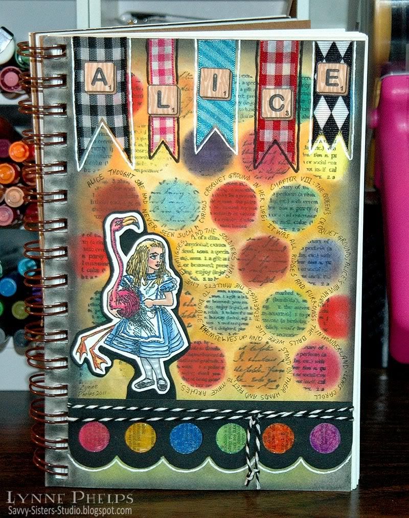
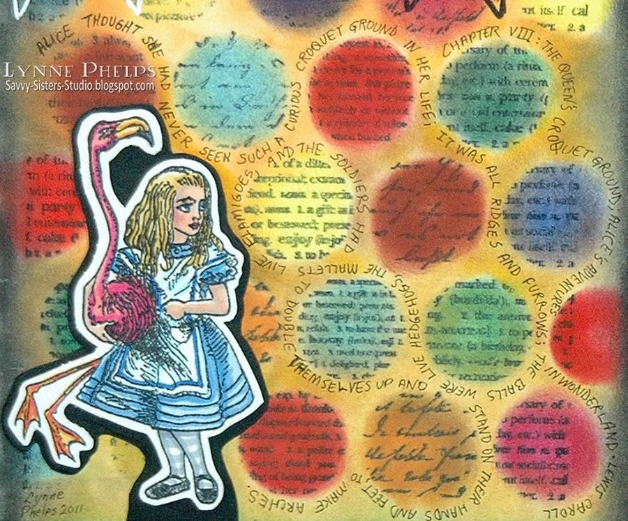
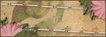
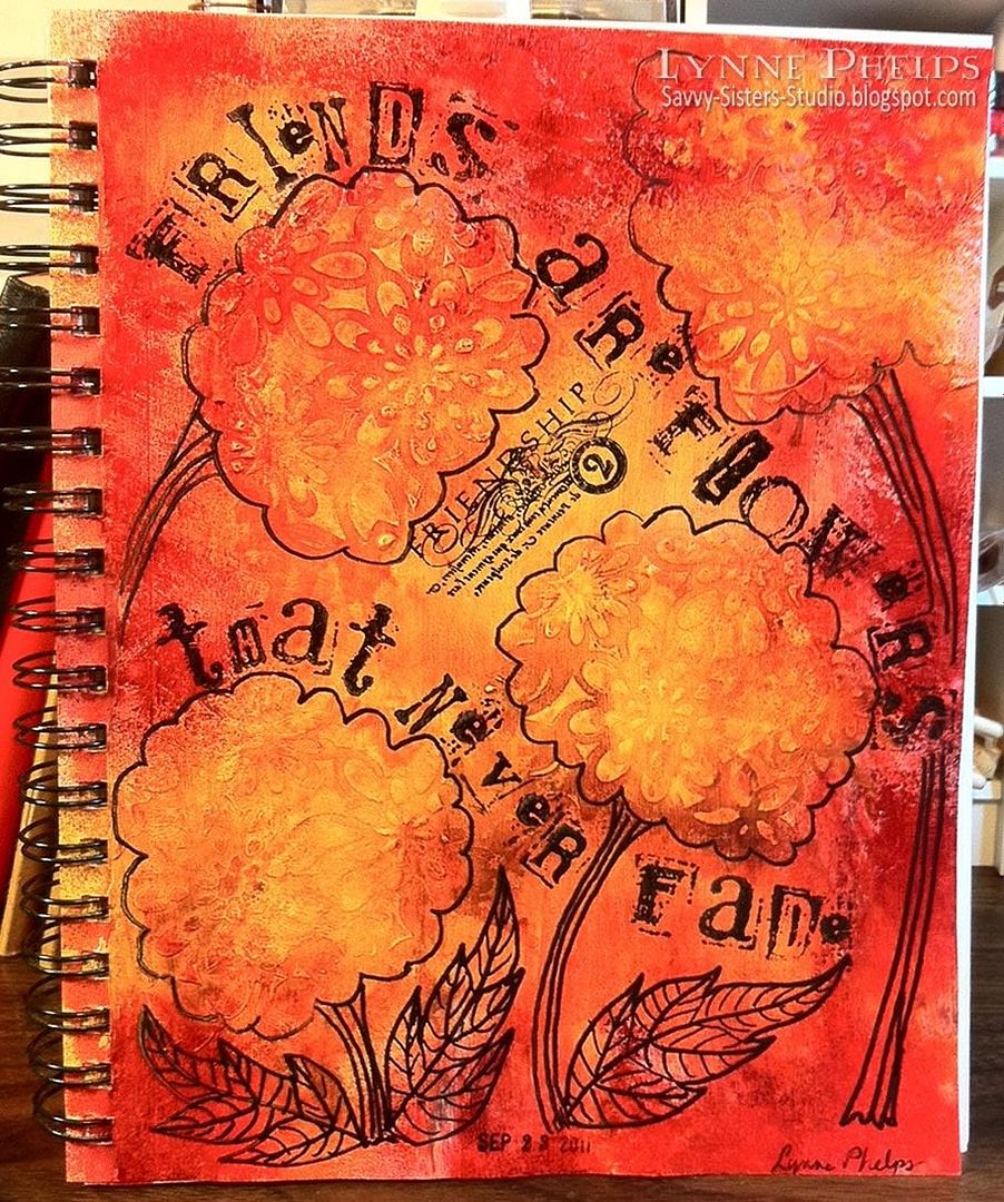
However, I had not really thought it through. I was thinking the acrylic gesso would act as a resist, but of course gesso is a primer and it is made to hold the paint that goes on top of it. I want to try this again with some acrylic paint, which I think will resist the subsequent layers of color. Still, the dimension of the gesso flowers caused the spray inks to pool around each raised area which gave a neat effect!

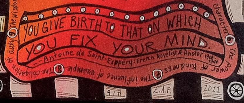
Then I added the words with my all time favorite alphabet set, the retired Stampin' Up! Collage letters and numbers. The Friendship stamp is part of a series of words by Kelli Everett from The Uptown Design Company, now sadly out of business. I used Stazon black ink; the stickiness of the ink was a plus on the non-porous surface. I used a black Sharpie to doodle flower outlines, stems and leaves.  A date stamp was added last.

Supplies: (Note - if you are reading this in email or a reader, you will have to go to the blog to see the supplies, just click the title of this post.)

Linky Tools - Personal Link Library!
There has been a lot of buzz about InLinkz new "Link Manager" tool.  I sent owner and programmer Brent Riggs a request to add this functionality to Linky Tools.  Three days later Brent contacted me to test the new functionality, and there is no extra cost or separate subscription! I can't tell you how wonderful it is working with Linky Tools.  I will do a separate post about the new Personal Link Library functionality; it is so cool. I just add all my supply links with thumbnail one time and it is so fast to do. Then I can pull those links onto any list I like! You'll be seeing lots of neat supply lists like this from now on. What tickled me (even more than the amazing responsiveness and quick turnaround) was that Brent featured my blog in one of the demonstration videos. I hope you'll check it out, my 90 seconds of fame, LOL!

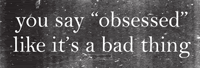
This was a really fun project. The quote seemed perfect as I was having nice messy fun with friends while making flowers! This page will always bring back memories of a fun evening.

Please leave a comment; your comments are what keep me blogging!
:-)
Edited to add:
Several people commented on the alphabet I used - Stampin' Up! Collage Alphabet and Collage Numbers. Although they are retired, the two sets are readily available on eBay. Click here to see the search on the US eBay, or search for this string in your country's eBay: 
"stampin up" ("collage alphabet", "collage numbers") 
This will search for the alphabet OR the numbers set, so you will see both! They are available at all price points.

Wednesday, September 14, 2011

Twelve Things to Remember. . . We will never forget.

Last week I visited my friend Molly and showed her some of the fun things you can do with PanPastels. I quickly created this vivid background in a Strathmore Mixed Media Visual Journal using the Sofft Tools oval sponge and the 20 painting colors set. They are completely erasable, so after I used a fine black Sharpie to draw my checkerboard border, I just erased the pastel and brought it back to a bright white page! The eraser was not the best, sure wish I'd had my kneaded eraser handy!

Click to enlarge

Molly had just received a Zettiology order, and I could not resist stamping this cool Teesha Moore image in the center! I used the eraser to create highlights in her face, legs, and striped sleeve. Then I used a fixative so I could add more layers without smearing. 

There are three really good quotes worked into this stamped image, but they are so tiny you can hardly read them. I decided to write them larger on my page AND site the sources. I am fanatic about listing the authors of things, and I like to list dates also when that adds interest. 

Can you see all the quotes? One is on her chest, another down the left sleeve, and the third is writing tiny, tiny, tiny around the whole figure:

Click to enlarge
I added white gel pen highlights to the figure with a Sakura white Gelly Roll pen. A little shine on her nose, highlights in her curls, and gleams in the whites of her eyes, white gloves, a dazzle on her tiara, it all really brought her to life! 

Click to enlarge
The quote on her chest reads "We should gain more by letting ourselves be seen such as we are, than by attempting to appear what we are not." was in the "Maximes" of François de La Rochefoucauld which began in 1665 and reached their final form in 1678. Isn't it fascinating how human nature doesn't change? This advice sounds as fresh today as it did in the seventeenth century! I wrote it in at the top with various black Copic Multiliner SP pens, then I doodled lines and added some white dots and outlined them as well.

Click to enlarge
All around the checkerboard border, I wrote in "Twelve Things to Remember" by Marshall Fields, the great Chicago retailer. It echoes the way it is written all around the edge of the figure. They are also sometimes called "Twelve Priceless Qualities of Success."

Twelve Things to Remember:
  1. The value of time
  2. The success of perserverence
  3. The pleasure of working
  4. The dignity of simplicity
  5. The worth of character
  6. The power of kindness
  7. The influence of example
  8. The obligation of duty
  9. The wisdom of economy
  10. The virtue of patience
  11. The improvment of talent
  12. The joy of origination
All things worth remembering, worth valuing, worth preserving.

Click to enlarge
The quote down the left sleeve says "You give birth to that on which you fix your mind." by Antoine de Saint-Expupéry, a French novelist and aviator who lived from 1900-1944. Another quote that is as fresh now as it was then. Of course the point of the quote is to fix your mind on good things, lofty goals, to dream great dreams. But it also works in reverse. Serial killers dream terrible dreams and fix their mind in directions they should never go and give birth to atrocities. Terrorists in some cave or compound fixed their minds on how to devastate America and gave birth to the destruction of World Trade Center, the Pentagon, the high-jacked plane of heroes. We all need to exercise some mental discipline to maintain decency, kindness, and civilization. We need to strive to fix our minds towards the good and so give birth to creativity, to joy and not to tragedy.

I still remember the day it happened. I was at work in a 50-story skyscraper in New Orleans. A friend called and said, "Get out of there! If the planes come to New Orleans it is your building they will hit!" I said what are you talking about and she said "Find a TV!" We all watched in horror in the conference room. Not one face without tears. Just the beginning. . . .

This page did not start off having anything to do with 9/11, but I finished it on the tenth anniversary of the tragedy and it seemed to apply. It was certainly on my mind as I researched all the quotes and added all the text. So I added the speech bubble to the figure. "We will never forget."

9/11/2001:
WE WILL NEVER FORGET.

Monday, September 12, 2011

And now for something completely different. . .

Click to enlarge
My little stamping group met recently at my friend Judy's house. She had prepared a really fun project for all of us to make! Using the Stampin' Up! Butterfly and Large Heart punches, she had dozens and dozens punched from the K & Co. Que Sera Sera pad. All of these were punched from the same pad, it has a wonderful range of colors. What beautful paper!

They were inspired by an example in this year's Stampin' Up! catalog at the top of one of the punch pages. A really fun fast project, especially since all the punching had been done ahead of time; thanks Judy!

Click to enlarge
We stacked two of each and used a repositionable adhesive to tack them down until we sewed down the center of each column from top to bottom. Then the top layer of punched shapes are folded up to give dimension. The card bases on the right are So Saffron Stampin' Up! card stock. They are straight stitched on a small sewing machine.

Click to enlarge
The cards on the left use a zig-zag stitch which I like better. The card bases are one of the new Stampin' Up! In-Colors, I love this shade called Pool Party. I sponged the edge of the white cardstock with Broken China Distress Ink.

If you need any of these Stampin' Up! supplies let me know; my sister is a demo and we always have some kind of special! We'd be glad to get you fixed up.

Let me know if you make some of these cards, and please leave a comment before you go!


Sunday, September 11, 2011

Week 2, CHAPTER 7: Text as Nonsense

I couldn't resist making a second project this month for The Altered Alice CHAPTER 7 Challenge: Text as Nonsense. I am in love with the wonderful silhouette stamps on the Alice 2 plate from our sponsor, Stamp Attack!

Click to enlarge
I created the first page in my new Moleskine sketchbook. I got two of them: a red sketchbook for Alice projects and a black sketchbook for everything else. (They were almost one third off at Amazon, just click the link at left!) The paper is so smooth and heavy, a dream to stamp on, and it smells wonderful!  You may laugh but I just kept sticking my nose into the pages and inhaling the wonderful aroma of this paper! They were so beautiful and pristine that it took me a while to actually get the courage up to sully a page with one of my artistic attempts. But now I'm over that, lol!


I began by painting a backdrop for my "shadow puppets" with PanPastels. The grassy area was done with the oval sponge and all the rest was done with the Sofft Tool palette knives. LOVE them!! I started off with the 20 set of pure mass colors (the "Painting" set of 20) but I am going to order the tints and shades next, plus the palette trays.  The bulldog clips just help to weight down the pages while I'm working on it. I knew the curtains would cover the sides and the stage would cover the bottom. The silhouette images were stamped with black Versafine.

The front of the stage was punched with an EK edger punch of card suits and I scribbled red marker in the heart and diamond openings. I created the scroll with the title in Adobe Illustrator. The admission tickets are an old Art Tickets set that is still available from Invoke Arts.


I ran book pages through my crimper in all different directions to soften the paper fibers before I tried to pinch and glue the curtains into place. They are sponged with Distress Tea Dye ink on the folds. The tiebacks are ribbon. The ALICE Scrabble tile word and the key stamped on the curtain valance are also from the Stamp Attack Alice 2 plate.  I love making these curtains; you can see my first attempt on this circus tent page!

I hope you enjoyed my little Wonderland Shadow Puppet Theater. Please leave me a comment and think about playing along in this month's challenge!

Sunday, September 4, 2011

The Altered Alice CHAPTER 7 Challenge Begins: Text as Nonsense!


Alice didn't dare to argue the point, but went on: `-- and I thought I'd try and find my way to the top of that hill -- ' `When you say "hill,"' the Queen interrupted, `I could show you hills, in comparison with which you'd call that a valley.' `No, I shouldn't,' said Alice, surprised into contradicting her at last: `a hill can't be a valley, you know. That would be nonsense -- ' The Red Queen shook her head, `You may call it "nonsense" if you like,' she said, ` but I've heard nonsense, compared with which that would be as sensible as a dictionary!' -- Chapter 2, Through The Looking Glass and What Alice Found There

Using text as pattern is a trend right now that I really love. Your challenge is to use text as nonsense - not to read but as pattern on your project! Of course you can still have words or sentiments, but we also need to see text used in a non-reading way. I have a stack of old books and dictionaries that I use for this purpose.


Our sponsor is Stamp Attack, a British company that is well known (among other things) for their fantastic Alice stamp plates which have sold to customers all over the world. In fact, Helena Bonham Carter, the actress who played the Red Queen in the Tim Burton Alice movie, purchased sets of Alice stamps from Stamp Attack, which were then delivered to the studio!  Enabler alert: Stamp Attack offers speedy worldwide shipping for only £1 on unmounted stamp orders, so go on and check out their beautiful stamps!

The winner will receive a Stamp Attack gift certificate for £13.50, which is equivalent to one of the stamp plates that the design team will be using!


You have until Friday, September 23 to enter your creation at The Altered Alice and the winner and honorable mentions will be announced on the last Sunday of the month, September 25.  All kinds of projects are welcome, they do not have to be "altered art" and as always, entries that feature some aspect of Wonderland are given two chances instead of one in the random prize drawing. You may enter multiple times as long as each project is on a separate post.

My Project


My art journal page was inspired by this Stamp Attack image of Alice on the Queen's croquet ground. The Scrabble tiles spelling Alice are another Stamp Attack stamp, cut apart and displayed on a banner of ribbon snippets, outlined with black or white. They are both from the Stamp Attack Alice 2 plate; it is a full-sized plate and the images are very deeply etched on thick red rubber.  I'm working on another project with this stamp collection so stay tuned!

Cling Rubber Stamp: Word PopsI am working in a Strathmore Visual Journal - the mixed media version. Love the heavy book board covers and the paper is great. The background of my page is a Hero Arts cling stamp called Word Pops; I had to have this stamp! The text circles were stamped and then the whole page was colored in using PanPastels (love them!). I applied the color using the Sofft Tool palette knives; this product is a unique cross between a soft pastel and a fluid medium. The black strip on the bottom was punched with a fun EK edger punch with scallops and huge dots, then backed with dictionary paper colored with oil pastels. That takes care of the "text as pattern" required by the challenge; all the circles make me think of colorful painted croquet balls, although I know Alice will be using hedgehogs instead!

It is a journal so I decided to include some writing. I had fun wrapping a quote from the story describing the croquet game around all the text polka dots! I used a Copic 0.2 Multiliner SP to scribble in this fine print. I love how this turned out. If you click the image above you can enlarge it enough to read the story. Please visit me at Savvy Sisters Studio and leave a comment, I love it when you do!

I hope you are inspired to make something and play along with The Altered Alice!

NOTE: If you decide to buy some of the products mentioned above, please consider using the links above to do so. I will get a tiny referral fee and you will get the same great price. It is a small way you can help to support this blog and The Altered Alice. Eventually it might cover my Linky Tools and professional Photobucket subscriptions, LOL!!! Thanks!
Related Posts with Thumbnails